Monday, November 30, 2009
Banff
I just returned from a trip from Banff and brought back some great pictures. I traveled to Banff with the main focus of skiing, but found some time to get some great shots. It's hard not take at least a few good shots in Banff, due the incredible mountains Banff National Park boasts. I've been many places on ski trips, and this place had to have the most impressive mountains i've seen so far. So if mountains are your thing, the Canadian Rockies are the place for you!
five favorite photos


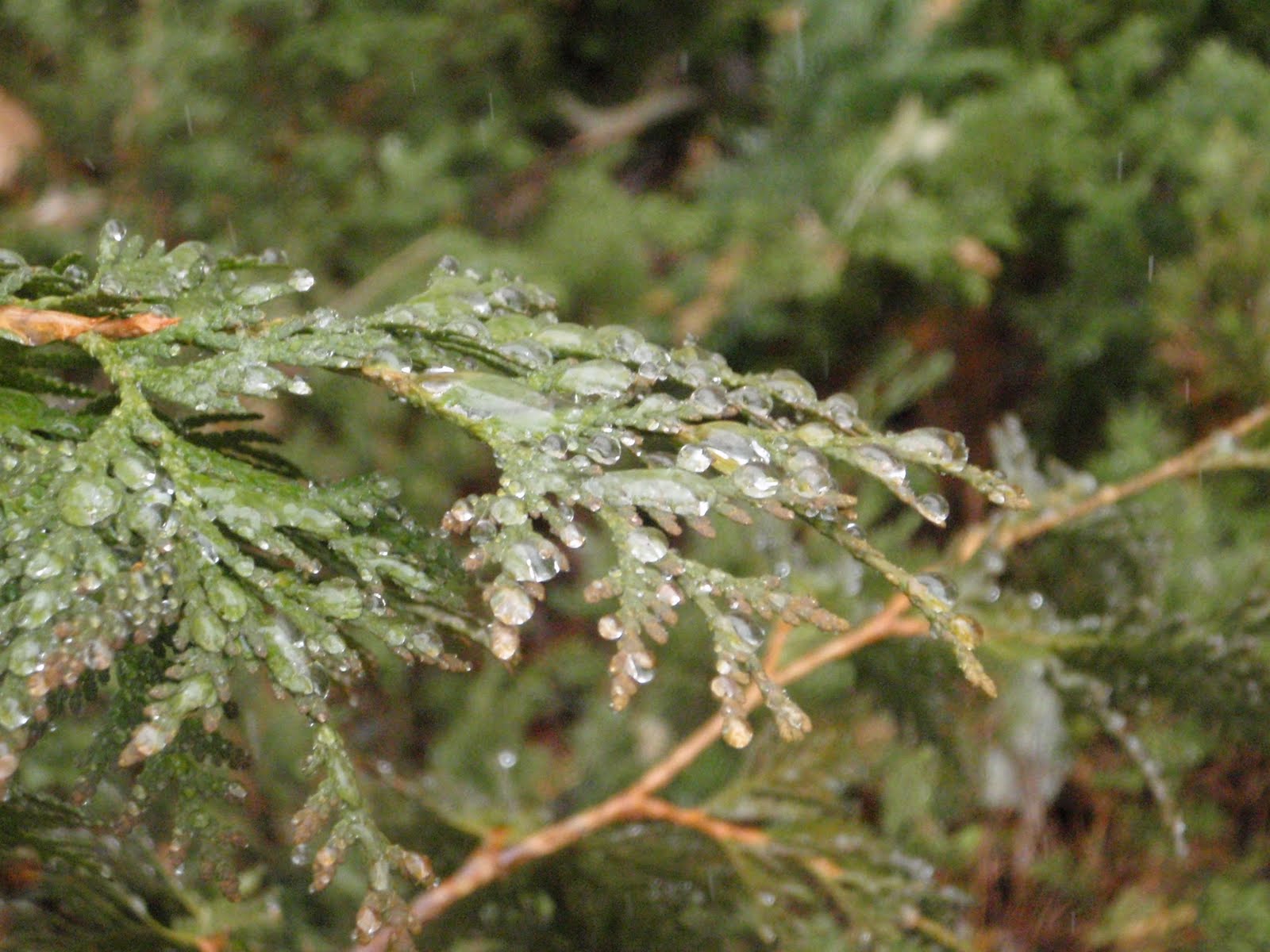
Over the course of this semester I took hundreds of photos, most of which were very unsuccessful. Through the process I did gain a better understanding as how to capture higher quality photos, and did come away with a few photos that I find visually pleasing. These are five of my better results. The photos are unedited because blogger doesn't seem to want to upload my edited form photos, which I have a feeling is due to my lack of computer suaveness. The two mountain scenes were taken in Banff National Park, the Bird silhouette and tree were taken at Two Moon Park, and last, the sunset was taken from my balcony in Billings, Montana.
Here are the settings for each shot:
1. Mountain: Shutter: 1/400
Aperture: f/5.0
Focal Length: 20.1 mm
ISO: 64
2. Sunset: Shutter: 1/40
Aperture: f/4.3
Focal Length: 15.52 mm
ISO: 100
3. Mountain: Shutter: 1/250
Aperture: f/5.6
Focal Length: 20.1 mm
ISO: 64
4. Tree: Shutter: 1/30
Aperture: f/4.5
Focal Length: 11.4 mm
ISO: 100
5. Bird: Shutter: 1/160
Aperture: f/5.0
Focal Length: 20.1 mm
ISO: 64
* All pictures were taken using my Olympus, Stylus model S850SW
Senior Show
I had the opportunity to tour the gallery with the art students who put together Rocky's fall 2009 senior art show, and was very pleased. The show included some very well done, thoughtful work. My favorite section of the show was Denise's installation. The work she had shown was not my favorite until she explained it. She suffers from some sort of arthritic disease, that makes life painful on the best of her days. She did some math and found she needs to 99 pills per month, just to make it through the day. She fears that if she her disease doesn't cripple her, the drugs will. Denise's installation really sets the mood of the struggle she faces on a daily basis.
Another notable artist from the show was Krista. I had been in a couple art classes with her and throughout the classes she has demonstrated how passionate she is about her work. Her senior show did not let me down. Her work reflected her love for what she is doing as an artist, and her love for for flamenco dancing. She is truly a gifted artist!
Wednesday, November 18, 2009
Snapshots
I didn't totally understand Jane Waggoner Deschner's artwork until a presentation she gave in one of my classes. I knew she was a fairly accomplished and experienced artist, but I didn't understand why an old snapshot could even be considered "fine art." Jane's explanation of her work totally inspired me and changed my view of photography. I previously felt in order for a shot to be meaningful or seen as fine art it must be taken using professional quality techniques and equipment. Jane offered a quote by Nan Golden that really helped me relate to her work; "The snapshot is the form of photography that is most defined by love. People take them out of love, and they take them to remember- people, places, times. They're about creating a history by recording a history."
Today, people see snapshots every day, whether on a fridge, photo album, or on websites like Facebook. We all have grown so accustomed to seeing snapshots that we have been desensitized to the true nature of them. The introduction of digital cameras has also robbed a bit of the nostalgia associated photographs by making it so easy to do. I think if where to pursue photography in the future I would strictly shoot subjects that I truly love, using older equipment, that requires time and care to develop. By doing so I would become much more personally attached to my work. It would also take a form of art I consider a bit technical to another level by connecting with one of the purest forms of human emotion; Love.
Tuesday, November 17, 2009
Photo Assignment


These are the shots I took during class on thursday...
Pictured in order:
-Silhouette
-Rule of thirds
-Detailed close up
-Blurred motion
-Hyperfocal
-Rule of thirds (My choice)
-Silhouette (my choice)
-Reflection
-Panning shot with sharp subject
-Use of red
Thursday, November 5, 2009
Reading assignment
This week I read three sections from my textbook, Nature Photography, by Tim Fitzharris. The first section I read was called The Power of Perspective. It identified some key techniques about how to create a sense of depth in photos using compositional elements, and camera settings/lenses. One specific offered is the use of size cues. Using the relative size of features within a landscape can create a sense of depth, because objects that are close appear larger than similar objects far away. Another way to create depth is by using a wide angle lens. They increase the perceived distance between elements in the composition and give a feeling of deep space. Other topics covered that help with creating depth are, the hight from the ground your camera is set at, overlapping of elements within the picture plane, side lighting your scene, atmospherics, and incorporating multiple planes within a shot.
The next section I read is, Nature's Mystical Mirrors. This section uncovers how to record dramatic reflections from water elements within a land scape. The section offers advice as to what kind of equipment is needed and how to scout out where you should shoot from in advance. It also touches on specific elements such as lighting, subject angle, and compositional elements, which all can play a part in getting a shot with beautiful ascetics. Last the section offers advise as to when the best time of day to shoot reflections is and how to use filters so that the reflection is sharp, and both shadows and highlights show fine detail and full color.
The final section read was, Working at close range. This section explains the use of accessories, and lenses for close up photography. The section first suggests the use of a macro zoom lens which can be quite expensive, but can be used on a range of subjects of a vast scale in size. Photographers can also work with different extension tubes and bellows, depending on how wary their subject might be. When ambient light is low the text suggests using supplementary lenses with teleconverters. Telephoto lenses are often your best bet when shooting wary objects because they allow you to maintain adequate distance from the subject. Wide angle lenses with short extension tubes create a feeling of expanded perspective, while tilt shift lenses make a maximum use of depth of field. Tilt shifts make use of larger apertures and faster shutter speeds which freeze motion. Last, the text covers the use of flashes when shooting close up. It's important to position your flash and defuse it in a way so that high lights are present, without over lighting the subject to the point that contrasts are washed out.
Overall I found each section very insightful, and can't wait to test out my newly learned techniques in the field.
Wednesday, November 4, 2009
Elements and Principals of Design
John Lovett is an Australian watercolor artist , who offers clear and simple insight about the elements of design at his website (www.johnlovett.com). Though Lovett is a painter, his insight can be helpful for photographers as well. A painter attempts to mindfully create a visually pleasing landscape using design elements. When photographers shoot landscapes, they use similar design elements. The difference is that photographers often must look for visually pleasing balanced compositions within what ever nature offers.
When explaining some of the elements of design Lovett covers, line, shape, direction, size, texture, colour/hue, and value. He offers simple, clear, and insightful explanations of each. Lovett also covers such topics as, Balance, gradation, repetition, contrast, harmony, dominance, and unity as they relate to the principals of design.
I found his website quite interesting and would suggest it to any one interested in painting, photography, or design.
Monday, November 2, 2009
Reading blog
Since my last reading blog I have read five sections of the Nature Photography, text book. The sections include. Photographs as Impressions, Getting Close, Animals in Action, Wildlife portraits, and Finding Photographic Landscapes. The first section; Photographs as Impressions deals with realism, and subjective imagery. The next section; Getting Close explains may techniques to get yourself within photographic range of wild life. The section stresses the importance of understanding your subjects habitat and behavior patterns. Animals in Action is the next section which covers techniques for recording animals in motion. The section has numerous hints for shooting birds in flight. The fourth section; Wildlife Portraits deals with presenting animals in a meaningful way. The section touches on building three layer picture spaces, which includes the foreground, mid-ground and background. It also identifies the importance, or meaningfulness of capturing sharp detail in an animals eye. The last section I read was Finding Photographic Landscapes, which gives clues how to evaluate potential landscape settings. Some visual cues to look for are, color, clouds, calm atmospheres, and having an open horizon on one side of mountainscapes. All of the information presented in the sections is insightful, and the pictures, are great!
Wednesday, October 28, 2009
Photoshop Lightroom 3 Beta
Adobe has recently released its latest version of Lightroom, which has been anticipated with high hope by many users. As of so far I believe they have once again delivered some outstanding imaging software. I have not had a chance to use the product, but I am also yet to see a negative review. Lightroom is a program in which you can sort, organize, develop, and publish your photos, or send them to photoshop for finishing. One of the added features to this version streamlines the importing process making it easier to avoid importing duplicates. The software also gives you access to all collections and recent folders, so you don't have to switch to the Library module to access photos.
Though the features listed above are quite convenient, one of the more dramatic updates is how it processes RAW files. Adobe has rewritten the demosaicing, sharpening, noise reduction, and vignetting algorithms, and the program now allows you to add film-like grain to your pictures. Some of these terms are meaningless to a guy like me, but to sum it up these features allow for much finer image quality.
With new editing software getting more and more sophisticated the need to take properly lit and exposed photos is decreasing. With this said, professional photographers in the future might have a hard time creating scenes superior to those using advanced editing software.
Wednesday, October 21, 2009
Surf Photography
I have always been amazed by surf photographers, they have got have one of the most difficult jobs in the industry. Many people appreciate the skillful risk taking surfers display in photographs, but overlook the guy taking the shot. Those guys are out there lugging cameras in the same elements, and get no recognition. I would conclude that photographing surfers is a cool sport in itself.
So for this reason I chose to read a beginners surf photography tutorial by Ryan Cardone. The part of the tutorial that caught my interest was the equipment section. The equipment is expensive in itself, plus you must factor in the price underwater housing. The cost of getting started in surf photography is hefty, so for a hobbyist it's hard to justify the investment. So to solve this problem the author suggests using underwater disposable camera or an Olympus underwater point and shoot. This statement totally inspired me because I have an Olympus stylus underwater camera, which I haven't found much use for underwater in the past.
Next time I'm on the coast I'm going to leave the board on the beach, and try to stay out of the surfers way as I snap shots of them.
Double angle shots
I was reading Chris O'Connell's photography blog and found some interesting stuff. O'connell is an action sports photographer who is well known is the skiing community. He has numerous shots in pretty much any ski publication around. Its almost hard to find a picture he didn't shoot.
Any way he discussed shooting skiers from two different angles in one shot by setting up a second camera on a remote. He included some examples of some of the work he created this way. Both angles were great magazine worthy shots, with two totally different compositions. In today's economy this sounds like a great idea. As O'Connell put it, "So of course, double the shots, double the cash in the pocket right?"
Tuesday, October 20, 2009
Design Assignment
 This picture was taken while on a spring back country ski trip in the Tahoe area. The significance of this picture is the fact that it was taken in a pretty desolate location, free from most human interference. As I looked to the sky there was a jet flying overhead, which illustrates the fact that our pure undisturbed natural areas are growing smaller and smaller.
There are many design elements that make this somewhat average scene a bit more interesting. The repeated diagonal lines along the ridge lines and jet stream is an interesting element that adds to the quality of the composition.
Another nice feature the large darker jagged rock formation in the lower right 1/3 quadrant of the scene. This is where I find my eye focusing first, then It follows the ridge line up to the jet stream. Which is in my opinion the center of interest. It brings a unique subject to an otherwise common scene. It breaks up the vast blue sky, drawing more attention to it.
This shot is the original, unedited version. I couldn't upload the edited version because I think it was to large. In my edited version I added a warming filter, which brought out some of the orange in the rocks. I also used a cooling filter on the sky, making it a bit more bold. With orange areas in the rocks complimenting a vivid blue sky there is a nice push and pull of colors going on.
Overall I wouldn't say this shot is a masterpiece by any means, nor do expect any one else to think so either, but as I stated above it has some significance to me so I like it.
Monday, October 5, 2009
Photo spot
When doing some research for a photo journey through Norway, I came across a scene that looks absolutely breath taking. The place: Lysefjord, in Ryfylke, near Haugesund. The two main attractions being Preikestolen and Kjerag.
The Preikestolen is a giant mass of rock that plateaus 604 meters over the Lysefjord. The giant rock is said to be approximately 600 square meters. That one impressive rock.
The Kjerag is an even larger than the Preikestolen. It towers over all the peaks along the Lysefjord, at 1,084 meters above the fjord. Once you have completed the hike to the top, the Kjeragbolten is a popular subject to be photographed. It is a round rock solidly wedged in a mountain crevice.
These are two sights I would love to one day visit and photograph. Upon finishing my shoot, I would be sure to base jump off them and possibly get some unique shots along the way.
Tuesday, September 29, 2009
Low Light
While completing my photo assignment I had difficulty getting good shots in low light. I was lucky to get any thing to show up at all. I later found that, though I reduced my shutter speed , I didn't slow it down enough.
To further understand how to work with low light I read some articles on Google. One article elaborates about how, the flash is the biggest solution to low light digital photography. However the problem with this is that not all situations can benefit from using the flash. Not only does it interfere with your “moment” socially and artistically, but the flash can flatten out your digital images.
I personally experienced the disadvantages of my flash during my project. The flash completely took any contrast out of the composition, which really flattened the photo.
Next the author explains and lists some methods he uses to work with low light, when a flash in not useful. He breaks it down in one clear and helpful list.
" 1. Crank ISO as high as it will go
2. Shoot RAW if possible
3. Use aperature-priority with the lowest f-stop on the fastest lens I have (f1.8 or lower if you can).
4. If that still caases my shutter speeds to be too low to hand-hold, then I might even set exposure compoensation down a stop, which will increase the speed a little, and then I’ll push the exposure in post (preferablly in RAW).
5. Lastly, I’ll use various forms of noise reduction to help on the grain/noise front.
Shooting Raw didn't really occur to me before reading this article, by doing so you can easily use photo editing software to enhance you image and reduce noise.
This is just one more tidbit of info I will utilize while taking future photos.
Wednesday, September 23, 2009
I read an article about food photography that i found quite interesting and funny. Turns out you gotta be pretty in tune with photography and the subject in order to get a good shot. I'm thinking when starting the article "OKAY" a cheese burger can't be to hard to capture, heck its not gonna run away from you if spooked. In the first sentence it read "Taking pictures of food is one of the most difficult skills a photographer can master." I was still not convinced, but then it followed with examples of ways it is such a difficult process. It gave examples such as; photographers must acquire knowledge of light, camera angles and the nature of the food being photographed. If any one of these elements, along with others, is miscalculated it could make the food look much less appealing. I gave that some thought and it all became more clear. When going into McDonalds the pictures of the food looks so tasty, but when you receive your order; the gift wrapped burger just doesn't look or taste like the picture on the menu conveys. Hmmm, that's weird, I gotta give credit to those McD's photographers. They are like the Great Houdini's of photography.
4 picture ideas
I a total nubie when it come to photography, but I'm exited to get started on my first photo assignment. For this reason I'm going to try to keep my subject matter simple, and use these assignments to explore. I don't think I'll be breaking new ground in the photo world for a while. For my wide depth of Field shot I would like to simply take a shot of a chain link fence or some sort of repetitive patterned subject, trying to make it look like it goes on for eternity.
For my next narrow depth of field shot I would like to get a good shot of my roommates puppy. He is letting me live with him for free for the month so I would like to give him some sort of thank you gift. This seems like a good way to kill two birds with one stone.
Next for my long exposure shot I was planning on either taking a photo of the canal behind my house as random debris float by, or if that turns out to be dull I would like to take some evening shots of cars driving by down town.
Lastly for my short exposure shot I was thinking of catching an object or person in motion. This will be good practice for ski season, when I'm capturing skiers or boarders doing there thing.
Wednesday, September 16, 2009
Stenciling like banksy
I've been playing around with photoshop a bit over the past couple years and have picked up on some fun effects. One I would like to share is how to make stencils for use in spray art or air brushing (The real airbrushing, not computerized).
First you open up the portrait you would like to paint in photo shop. Crop out your model, or image you choose to paint from the background. I prefer using the magic wand tool. Next, on the top tool bar click on image. Then scroll down to adjustments from the adjustments tool bar find curves. A graph should pop up with a input and output options. Enter around 140 for input and 170 for out put. This should alter the image so that the light areas and dark areas are over emphasized.
Next go back to the image adjustments bar and choose threshold. In the threshold input box enter around 94 or so. (The number might be very depending on the lighting in the photo, just play around with it until you find your desired effect)
From this point you are almost done. Next take your paint brush tool to touch up any blurry spots. Once all your lines look sharp using you paint brush bridge any islands of black so that they are not lost in the stencil cutting process. At this point you have your stencil ready to print.
Print your stencil, glue it to some cardboard or tagboard and go to work in it with a razor knife. Upon completing these steps you stencil is complete. All that is left is to line it up on your canvas and spray paint over it using light even strokes.
Remove stencil and WOW! you have a life like two color image.
Note: For best results start the process with a sharp image, that has dramatic light and dark lighting effects.
Exposure
After listening during tuesdays class and reading the section on Exposure in my Nature Photography book I have come to the conclusion that I don't understand what is going on. I have absolutely zero experience with cameras (bought my first point and shoot couple months ago) and feel like I'm learning a new language. For this reason I think it would be best to meet with Dave and get a bit of tutoring before I go on and write a blog pertaining to exposure. Hopefully my future blog Exposure II will be more insightful.
Thursday, September 10, 2009
Super Telephoto lens
If I were to buy a super telephoto lens I think I would get a 500mm. It would work well with a camera with full frame sensor features, which is the route I would like to go. It also is a bit lighter and most important to me, a but cheaper than the 600mm. Unfortunately I don't have an extra few thousand dollars laying around, and if I did I think I'd end up blowing it on a snowmobile. By going this route I will be able to access much more interesting secluded scenes for landscape shots. Most wildlife in the area probably won't stick around, but I won't have the proper lens to tightly frame them any way.
Wednesday, September 9, 2009
First 3 chapters
After reading the first 3 chapters of Nature Photography, by Tim Fitzharris I have taken a lot in. I started out the book with no photographic experience, Though I stall am yet to take a picture using any skills or knowledge taught through the book, I feel when the time comes I will have at least the general knowledge of what kind of equipment I will need to take professional grade shots. Now if I could just figure out how to fully take advantage of the features of these over praiced idems! Though I found the text insightful, My favorite aspect of the book is the photos. There are some beautiful shots on every page, which makes me hate by business textbooks even more so. To be fair I really don't think I could get through to many accounting chapters if they were riddled with distracting photos on every page.
Wednesday, September 2, 2009
Asa Gilmore
So I once met this dude who's photography blew my mind. Well Actually our parents have a short lived marriage together. Any way I still check up him through his blogs and websites now and then. It's interesting to see how his body of work changes and grows in the time between my check ups.
The artist's name I speak of is Asa Gilmore, he works in a wide range of mediums incorporating graphic design, web design, photography, and videography. His commercial projects have included corporate identity, album covers, aerial videography. He also has built numerous websites and done commercial photography as well. Most of his work is very edgy and unique. His ability to create a perfectly lit scene, or capture the natural light within a frame is what truly sets him apart from others in my mind. I would suggest looking him up some time at asagilmore.com.
The artist's name I speak of is Asa Gilmore, he works in a wide range of mediums incorporating graphic design, web design, photography, and videography. His commercial projects have included corporate identity, album covers, aerial videography. He also has built numerous websites and done commercial photography as well. Most of his work is very edgy and unique. His ability to create a perfectly lit scene, or capture the natural light within a frame is what truly sets him apart from others in my mind. I would suggest looking him up some time at asagilmore.com.
Thursday, August 27, 2009
Andy Goldsworthy
Andy Goldsworthy stunningly brings sculptural elements to nature photography. He has created a sort of art all his own that is more than note worthy. His sculptures are created entirely by manipulating found elements within nature. In his words "Looking, touching, material, place and form are all inseparable from the resulting work. It is difficult to say where one stops and another begins. The energy and space around a material are as important as the energy and space within." When a photographer captures a landscape he or she is capturing all the natural elements of a location that are occurring during a specific moment in time. If you take a mountain scape shot at two different seasons of the year, the result would be two dramatically different scenes, as would Andy's sculpures. His sculptures are built using natural elements and left to decay as seasons or weather changes. So in a sence his works are snap shots of whats occuring naturally. Like I said above, his work is more than note worthy, it's Goldsworthy. Ha ha
Subscribe to:
Posts (Atom)
